

They made this on purpose
Why do Simon & Schuster's new classics covers feel so strange?


Hello readers! In today’s post we, Nathaniel Roy of A Book Designer's Notebook and Abra McAndrew at The Booktender, unpack the visual strategy behind Simon & Schuster’s rebrand of 2026 film-adapted classics as part of a “Female Filmmakers Collection.” It started with Wuthering Heights timed to coincide with Emerald Fennell’s controversial adaptation last February, and now as Georgia Oakley’s adaptation Sense and Sensibility approaches its October release, the second book in the series will be available August 4.
Who are these for and what were they thinking when they made this?
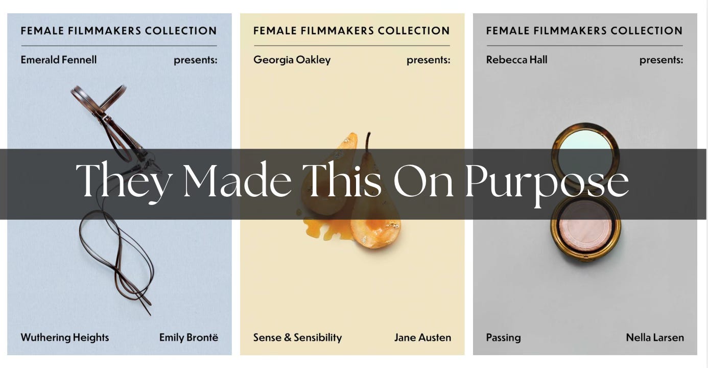
AM: I posted a derisive Note to Substack followers when I first saw the Emerald Fennell Presents: Wuthering Heights cover at my local Barnes & Noble— and your reply was “Thanks. I hate it too.”
You’re my favorite cover designer on Substack, so I want to know: From your professional perspective, what exactly are we looking at when we look at this cover, and why does it bother you?
NR: It bothers me because, like you, I think I did not even realize I was looking at a Wuthering Heights cover at first! The title and author of the book are given the lowest order of typographical hierarchy behind the series and then the filmmaker. Even the standard movie-tie in covers that people hate would still display Brontë’s name and the title of the book with more prominence.
Furthermore, even if we were going to highlight the filmmaker here, the style of this cover is so antiseptic. From my understanding of it, it is not a good representation of Fennell’s filmmaking style. The cover reminds me of Peter Mendelsund’s covers for Michel Foucault’s philosophy books.
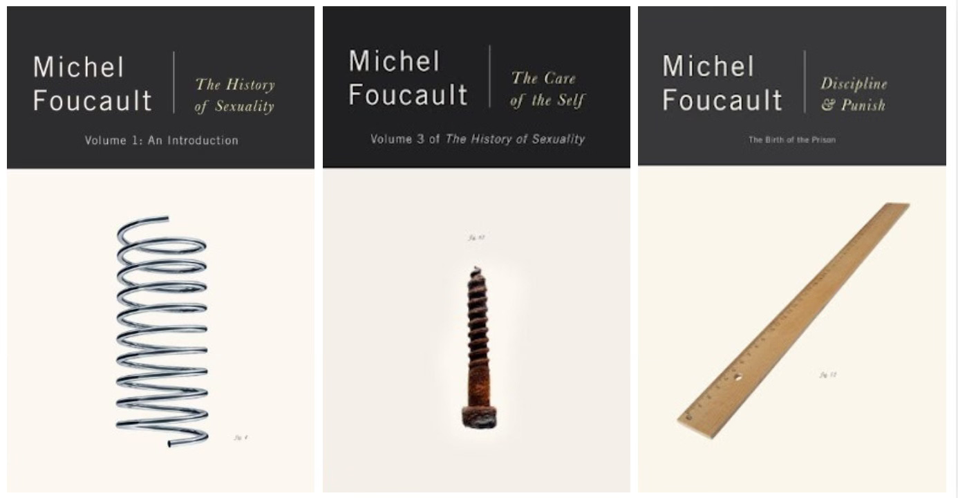
AM: That’s funny. I was at a bookstore in Evergreen, CO recently and the other customer in the store was a father who said he was a “math guy” looking for recent nonfiction recommendations for his high school student. He wanted him to develop vocabulary this summer before he retakes the SAT. The bookseller made a lot of great suggestions, but he decided to go out on a limb and left with Discipline and Punish. It was that copy with the ruler on the cover. I hope they’re still speaking.
When I first saw the cover we’re talking about, I was looking for one of Melissa Broder’s books. I saw that cover, face out with Fennell’s name so prominent, and my first thought was that I must have wandered into the Fs, and that she had written a book herself.
Also the image seems wrong to me not only stylistically as you mention, but also a representation of the novel. It references a couple of edgier scenes from the film, in which Heathcliff catches Catherine in a voyeuristic thrall as she peeps on some servants engaged in “pony play.” This becomes key to how the film tracks the erotic charge between the pair. But these scenes are not even in the book! Horses are only for transportation in the novel.
It makes me wonder: The next book in the series is Sense and Sensibility with a foreword by Georgia Oakley, on sale August 4 in advance of the October film release. So it’s not about Emerald Fennell making a grab for the marquee. This is a deliberate packaging strategy.
As a designer, what’s the brief you imagine went into this choice? Who is the customer?
NR: To be clear, I highly doubt Fennell or Oakley had anything to do with these covers! They are “presenting” here, but I don’t believe they are in any way architects of this series. I think they are merely writing introductions. So that also feels misleading in a way that adds to the weird taste in our mouths.
The brief for any series design is about unifying disparate texts under a single, recognizable visual approach. So under that metric alone, I’d call these covers successful.
But one of the dangers of series design, seen here especially, is that you can really sand the edges off of a particular book in the name of that unity. I can hear the designer, art director, marketer, or whomever (it’s impossible to know who’s driving the decisions here) that these are such well-known texts that they can withstand just a drastic treatment—and I agree! I often love when the work of a long-dead, famous author gets repackaged in a fresh, daring way. I can even get on board with the logic of pulling out a single, thematic element to feature on the cover. I’m not against minimal covers, far from it.
But I think that it’s a misstep when you combine this visual approach with the typography choices we mentioned above. You’re shortchanging the actual text—the thing you’re hoping someone will buy and read—on two levels, and I think that is why these ultimately don’t work for me.
Who is this for? It’s a good question. I’d have to guess film fans. People who don’t just care about movies, but care about people who make movies. It’s the only explanation I can think of for making the filmmaker (and series) name so much more prominent than the author and book title. I don’t know if a casual fan of the movie is going to pick this up, or even know Emerald Fennell’s name. I think the casual film goer would pick up a standard tie-in or one of the other hundreds of available “regular” covers if they wanted to read the source material after seeing the film.
You could argue it’s for super fans of this kind of 19th century literature, completionists if you will, who also go see every adaptation. But I think these types of readers don’t generally love movie tie-in covers. So this cover might alienate that group because of its focus on film and the fact that the image chosen for the cover has so little to do with the book they love.
You could also argue that the audience is “creative feminist” types, based on the foregrounding of “female” in the series title.
These are somewhat niche audiences, so I’m curious how these books will do for Simon & Schuster. We are talking about public domain texts here, so depending on how many they’re printing, even modest sales might mean profit for them.
Booksellers/others with access to relevant data, please let us know in the comments: how did this edition of Wuthering Heights fare against more traditional copies of the classic since the film came out?
AM: Yes, I noticed that too. And I think that’s part of what I found jarring. In my view a true feminist would never unironically use that “girl boss” or “lady author” language, the same way people who say “’Frisco” mark themselves as outsiders.
You’ve mentioned that these cover images are different from the typical tie-in cover. Those covers generally get a bad rap, so it makes sense that the publisher would try push a series in a different direction.
Do you think that reputation is justified? When an adaptation cover works, what makes it a good cover that changes how people come to a book? Are there examples you’d hold up for doing this honestly?
NR: You know, I don’t know if it’s totally justified. I don’t like them, to be clear, but I think I’ve softened on them over the years the more I’ve weaseled my way into the publishing industry. Publishers need to make money to put out the next book. This is true even if that money could be distributed better and publishing wages are generally pitiful. If it gets a good book into someone’s hands for a couple fewer bucks—or dirt cheap if it’s in the thrift store or little free library—I can’t knock it. And besides, I think movie tie-ins serve another purpose: alerting a bookstore browser that the movie was based on the book. Not every adaptation is as famous as Wuthering Heights!
Ironically, I kind of like the regular movie tie-in for Wuthering Heights. Is that ridiculous?
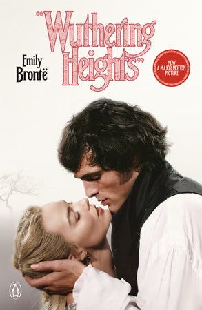
This is probably because the design for the movie is already in conversation with the so-called book look, real or imagined. I liked the stylized title treatment from the moment I saw the trailer ahead of Hamnet. Margot Robbie and Jacob Elordi are almost posed like an old bodice ripper cover. Maybe this doesn’t work for the book, and maybe it highlights what Brontë fans don’t like about the film, but I find this cover’s visual references far more interesting than a lot of the usual movie poster fair.
But I don’t know if we can call that cover “honest.” Then again, maybe they’re all honest in that they are so clearly cash grabs!
Hell, Penguin is putting out a new edition of The Odyssey this month. It’s not a tie-in with the Nolan film, and there is far more craft involved with its cover, but I’d argue the intent here is the same as any tie-in.
I’d rather buy a movie tie-in cover than a cover with one of those god-forsaken “stickers” printed on the actual cover that say “now on Netflix” or whatever.
AM: Yes, I could totally see that cover on a nightstand in the 1980s.
It’s true, the interpretation of Wuthering Heights as some kind of straightforward friends-to-lovers romance with a side of kink is part of why Brontë devotees loved to hate Fennell’s film. The darker, unspoken aspects of the developmental psychology under the mutual obsession of the two is left as a question, “did they or didn’t they?” in the novel. That the film resolves that so graphically and treats the death that makes the novel a gothic tale as the story’s tragic end, rather than the beginning of a discomfiting haunting, changes the way Wuthering Heights fits into the “romance” genre entirely.
I’m curious: If a publisher called you tomorrow and said, we have a classic in the public domain, it’s being made into a film — what kind of cover might you design?
Oh, man. It depends. But knowing myself, I’d probably want to try some sort of collage. Collage is all about juxtaposition—the combination of seemingly unlike elements into one composition. I think it could be the perfect medium for bringing the familiar and new together on a cover for a book that everyone knows.


AM: I love your collage covers. Thanks so much for chatting with me, Nathaniel. For those interested in an insider’s view of cover design, I really love these posts from Nathaniel’s newsletter A Book Designer's Notebook.
Cover Design from Hardcover to Paperback (with an Italian Twist) featuring covers for Jessica Berger Gross’s debut Hazel Says No.
A peek into Nathaniel’s studio: Tools of My Trade
Sense and Sensibility Adaptation Releases in October
The trailer for Georgia Oakley’s film dropped Thursday. I’m inclined to think fans of Austen will be relatively pleased. The tagline on the official poster is “No one knows your heart like a sister.” From the looks of it, the film will focus on the bond between Elinor and Marianne, the two teenagers at the heart of Austen’s novel. The gilded pear on the book’s cover may reference the effort to balance the two halves of the sisters’ conundrum. How to marry for love and for money?
Seems that this movie will be a gorgeous, naturalistic— if slightly Brontë-ified (unspoiled meadows! rain! lightning!)— interpretation of Austen’s mannered world and its economic stakes. I wonder if being part of this publication series led by Fennell’s release will help or hurt Oakley’s reputation with readers. Let us know what you think in the comments!
I am eagerly awaiting predictions on this film from the Austen-heads whose newsletters I follow. Sara Hildreth, Plain Jane, a. natasha joukovsky, haley larsen, phd: what say you?
If you enjoyed this post, you may also like these other collaborations:


I’m really enjoying these conversations. Got a piece of the book discourse you’d like to dissect with me? Get in touch!
Cheers,
 | A guest post by
|